Convenience Computing

Making it easier to just do it

Solved: Unknown build error Xamarin Studio on solution checked out from VSTS but created in VS

I recently came across an issue when setting up a demo for TechDays online. Part of the demo involved sharing a solution between Xamarin Studio on a Mac and VisualStudio on a SurfaceBook. The original solution was created in VS and uploaded to VSTS for source control.

The problem came when checking out to Xamarin.Studio on attempting to build I got an Unknown Build Error.

The Solution: After many attempts, Clint Francis form the Xamarin UK team spotted that the VSTS repository name had a space in it and the Git client in Xamarin.Studio had converted this to %20. Removing this allowed the app to build.

Solved (sort of): Xamarin.Studio 6 locks up/freezes/never-ends when building or cleaning

A number of people I know have been reporting issues where Xamarin Studio 6 on the Mac will appear to lock up when building or cleaning a Xamarin.Forms  solution. It doesn't seem to matter if it is an Android or iOS project the only common denominator appears to be that there are additional Nuget packages in the project (which of course there would be with Xamarin.Forms) 

The problem also appears if you open the solution and try to update the Nuget packages.

There are a number of posts about this in the forums and a few bugs raised. It appears that the support team are having trouble tracking down the issue but the theory seems to be it is something to do with the Nuget packager.

I've been investigating this and whilst I haven't found a definitive cause I have found a work-round which works consistently for me.

Step 1: Disable your network connection

Step 2: Start Xamarin Studio

Step 3: update one of the nuget packages in your project. I have found this works best and consistently if you use one of the Android Support packages but it will work with the Xamarin Forms package 

Step 4: wait for the package update to time out and fail

Step 5: Build and run your solution - it may take a little while but it should now run - it always does for me.

Step 6: Reconnect the network - you should now be able to build and clean until you next restart studio


Hope this helps someone

Garry

Looking for Xamarin consultancy - check out my company www.AppXib.com

Review: Incomedia Website X5 Professional version 10

Incomedia's Website X5 tools come in many flavours from a very reduced functionality free version to the hundred and sixty nine pound professional version reviewed here.

All versions act in a similar way allowing you to design websites based on pre-defined or your own templates. This version has access to over 1500 templates and some of them are really pleasing.

The great thing is that you easily edit the templates. One trick though is to get full editing capabilities on an existing template you have to choose to duplicate that template. If you just select an existing template then you will only be able to edit the graphics for the header and footer. For many websites this may well be sufficient and is certainly simple and clever. One thing I really like is the sophisticated  effects built in to this editor. These work with both text and images and allow for things like drop shadow, mirroring, cropping etc.

The process

When you start Website X5 you are presented with a selection of either starting a new project or editing an existing one. You can also choose to duplicate an existing one. This could be very useful for the small scale web shop who use a very similar website for all their clients with the same plugins. They could create a base website with all their standard plug-ins and custom JavaScript and then just duplicate it and change the template.


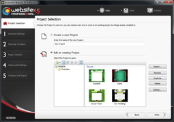
When creating a new project you get to enter some baseline information including usefully the description and keywords. I should mention that each step in the process has really good help attached to it accessible from a button at the top of each page.

You can also easily add a website icon here.

You are then given the choice of selecting a template from the extensive list or creating one either from scratch or by duplicating an existing template.


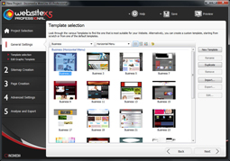
I found the organisation of the templates a little limited I would like to see more specific categories or perhaps some form of keyword search. For example there is a very useful section for mobile friendly templates but there is no further distinction within that. I would also like to see some way of seeing a larger preview of the template as the thumbnail images provided in the list are a little small to see detail. Having said that there are a lot of templates available and I am sure most sites could be based on one of them. I say most because there is an assumption that you will be building a menu based site. That Menu can be Horizontal or Vertical but it has to be there. The good thing is the menu is automatically created for you and you can edit its style to some extent.

If the templates in the app are not cutting the mustard for you then you do also have the option of visiting an online library of templates at the WebSite X5 web site. Some of these are free but there are also paid items. This is a very extensive library.

However if this is not enough then you can create your own template. WebSite X5 also helps here by providing a pretty extensive selection of Royalty Free imagery for free to users. I really liked this library and there is a really good selection available.


As previously mentioned custom templates can be created using either by duplicating an existing template or starting from scratch. 

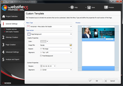
 The custom template editor is pretty powerful and covers most thing you would want to do within site design within the aforementioned limits of a menu based design.


Once you have selected and edited your template you will want to start adding pages. In Website X5 this is done using the Sitemap editor. Here you can easily add pages and group them into folders. You can even mark pages as Work In Progress so they won't appear in a published site but will appear when testing. You can also mark pages and folders as hidden so that do not appear in the menu. The website's menu will automatically reflect what is entered in the sitemap. You may recognise that this sitemap concept is similar to that used by Google's Webmaster tool and indeed Website X5 can generate the xml to upload to Google.

One thing I would have liked to see was a way to mark a folder as Work In Progress. At the moment even if all the pages in a folder are marked as Work In Progress then unfortunately the empty folder will still appear in the published website's menu.

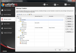
I did find the SiteMap editor very easy to use and it was simple to set up pretty complex structures. Creating the pages themselves was also very easy. The content area is basically a grid you drag and drop elements onto. You can easily add and delete columns and rows.  The elements can be sized to take up more than one row or column. I was able to create some quite sophisticated layouts this way. I did find sizing the rows and columns a little tricky until I realised they were based on the content sizes. The Help button was again useful here. Indeed I will commend Incomedia on their excellent onscreen hand holding throughout the process.

The elements you can drag onto the page include:

  • Text - slightly more than just a text box as it can contain images as well. This allows some quite sophisticated layout. In the pro version you can also make this box Tabbed and the generated control supports touch swiping between pages on mobile devices. I did have two slight criticisms of this element. Firstly the excellent image editor available throughout the rest of Website X5 is not available here and secondly unless you add more than one tab you do not seem to have access to the sizing options.
  • Image - This allows you to add just an image but does have the excellent image editing tools with effects, border and masking available along with the ability to crop, rotate etc. I found I could do most things I wanted to with images directly in this editor
  • Table - creates a table within a table - only Text and images can be entered in the cells.
  • Gallery - This is a very powerful tool for creating image galleries within your site and as each image can be assigned a link it is also quite a nice way to create a very visual menu system. All sorts of galleries are available and in the professional version there is a very nice 3D touch enabled option
  • Vide and Audio - as the name suggests this is for adding either local or web-based audio and video files. There is also a nice HTML5 option to allow you to include alternative formats of video
  • Email Form - A quite customisable email request form. Possibly a little lacking in style options
  • Social Network - Really simple way to add follow and like options for Twitter, Facebook, Google and even Pinterest
  • Guestbook - a simple guestbook option
  • Map - a way of adding a google map to your site. I would have liked to see other mapping providers included.
  • Flash Animation - upload your swf file or link to one on the web. I was impressed that they had thought to include an option to upload any supporting files the swf file needed.
  • Product List - Part of the ecommerce system provided in both the evolution and professional versions. This is a pretty simple shopping basket system but does allow links to payment providers including PayPal. It is certainly a simple way to provide purchasing options.
  • Dynamic Content  - this is basically a textbox that can be edited online by authenticated users. It is only available on the professional version. This is not a  content management system and I think is one of the weaker parts of the offering with very limited formatting options offered online.
  • HTML and widgets - This is what makes this package different to most Template based tools. You can add virtually any HTML or JavaScript you like to your page. There are also a number of common bits already provided including Google Translate

I was surprised how easy it was to add sophisticated content to the site but equally how easy it was to get started.

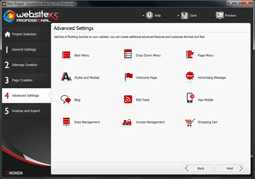
The next stage is to select advanced options. These include:

  • a reasonably powerful blog engine.
  • Ability to edit your menu style.  
  • A way to set up access rights.
  • You can change how data is stored.
  • Add a welcome screen
  • Add an advertising popup or over - I particular liked the page fold effect.
  • Set up your shopping cart
  • Add RSS feeds
  • In the professional version the ability to  link to Incomedia's FeedReady app downloadable for iOS and Android (they really need to do  a Window's Phone version now with the rapidly growing uptake of that platform). this allows people to access your website's content from a fairly slickly designed mobile app. It is however not a specific app for your site.

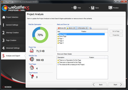
Once you have finished your design you go to the Analyse and export page

The Analysis page checks your content for completeness and looks for thing like missing keywords and alt text. I found it quite a nice visual aid.

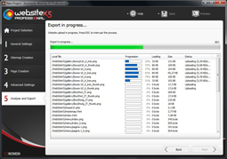
Publishing to a host is done over FTP. This seemed pretty painless. One point to note is that if you want to publish to a folder then that folder must already exist.

The Evolution and Professional versions of WebSite X5 both come with a year's web hosting as part of the price. With the Professional version this is provided by the excellent A2Hosting which is somewhat better than most build your own website tools provide. The really nice thing about this hosting is it allows for unlimited domains to be hosted.

You can also publish to a disk file suitable for placing on a cd rom or usb drive. If anyone does disk based Computer Based Training still this could prove useful.

You can also choose to export the project for use in another copy of WebSite X5 - the license allows installation on two PC but not use at the same time.

One nice thing the professional does enable Mobile friendly features like touch enabled controls. It also attempts to optimise the site for mobile. I didn't find it always did a brilliant job especially on Windows Phone. Having said that the Mobile templates supplied are really good and it is really easy to duplicate your desktop site and apply the mobile template.

Conclusion

I was actually far more impressed by WebSite X5 than I thought I would be. I usually find template based tools way too restrictive. There are still restrictions with WebSite X5 but I could work round most of them.

It can appeal to both beginners and experts.  it is very easy to follow and the built in help is really good. The range of templates is very good and the free image library a real bonus.

For small web houses who have to churn out lots of websites at a low cost this could be a very worthwhile investment.

My one question would be what the Professional version offers for its hundred pound plus price difference over the Evolution version For this you get slightly improved ecommerce, the quite weak dynamic content option, a guestbook, the much better free web hosting for a year, access to the FeedReady mobile app, better mobile web handling including touch ready controls and improved membership tools.

The webhosting on Professional does allow for hosting unlimited domains and is the equivalent of sixty pounds in value so that is a definitive positive. For me the improved mobile controls are just about worth the extra.

I had two updates come through in the time I was testing so it does look like the package is being actively improved and I can hope that Incomedia will quickly fill in the few weak spots in particular the dynamic content and ecommerce sections. Having said that the flexibility to include your own HTMl or CSS certainly allows for other content management or ecommerce solutions to be plugged in.

All in all a well designed package with excellent hand-holding. I certainly recommend taking a look especially if you need to knock up a website in a hurry.


News: Incomedia launches WebSite X5® Professional 10

I haven't had a chance to look at this yet but it looks intriguing. The press release below.


Incomedia, a company with many years experience of web site creation software development, has released WebSite X5® Professional 10. This new software is designed to meet the needs of web designers and SMEs for creating web sites and mobile sites. It is even complete with App. 


“We are very excited to expand our product range and also to target the business sector with the new WebSite® X5 Professional 10” said Incomedia CEO Federico Ranfagni. We have many years  experience which we have drawn on to create this new product. We have developed a software program able to meet the needs of Web professionals. We are aiming this product not only at web designers but also independent professionals and those who have to develop a web site for their company or corporation. They need agile and flexible tools that quickly lead them to outstanding results. We are convinced that WebSite X5® Professional 10 is the answer. The tool will radically change the way these professionals work.”


The advantage in choosing WebSite X5® Professional 10 is therefore obvious. It saves time and resources so professionals can handle a larger number of projects without jeopardizing the quality of the web sites they create. The result? More satisfied customers for a higher overall gain.  


First-Rate Functions:


Some of the most important features of WebSite X5® Professional 10 are:


·         Mobile App – WebSite X5® Professional 10 is the only software that lets professionals create a site complete with a Mobile App without having to develop the App. The App is ready and available for free download from both Apple Store and Google Play. Simply anchor it to your project and invite users to download it to stay abreast of the news published on the site. With the ability to send Push notifications, the App is also an effective system for actively promoting any news or activities.


·         Mobile Web sites – The sites created are automatically optimized for viewing on mobile devices. Everything works correctly while browsing on smartphones and tablets (including the online store). Touch gestures are fully supported to ensure a fantastic surfing experience.


·         Dynamic content – WebSite X5® Professional 10 is not a CMS, but integrates its most important functions. It lets several people edit content such as text and images while working directly online.
All this is thanks to the use of Dynamic Content. The author of the site, who always has total control over the project, can use it to create pages on which the users he authorizes can make updates.


·         Online store – With WebSite X5® Professional 10 you can set up a complete online store and define all the key elements: importing products and catalogue creation; setting shipping and payment methods; buying process configuration; availability and promotion management through discounts and coupons, etc. 


·         Database integration – It is possible to integrate the web site with one or more databases for sending e-mails, registration to use restricted areas, plus management of posts on Blogs or Guestbooks, or purchase orders coming from the online store. The operation is simple and lets you also manage data with a dedicated online control panel.   


·         Analysis and Optimization – WebSite X5® Professional 10 optimizes the pages, images, videos and products of the store in order to best index them on search engines. Furthermore, with the advanced project analysis function, optimizations are still possible prior to publication online.


WebSite X5® Professional 10 includes a web hosting service with web space, bandwidth, databases, e-mail addresses and unlimited site hosting for 12 months.

For more information on WebSite X5® Professional 10: http://www.websitex5.com/professional


Windows 8 Upgrade from Windows 7 issues and solutions

 
Over at TheDigitalLifestyle.com one thing I've been getting lots of mail on is installation issues in Windows 8 when upgrading from Windows 7. I thought I would gather some of the possible solutions here.

The symptoms are that the upgrade process will reach a certain percentage complete and then come up with a really unhelpful message saying Windows Installation has failed. 
Disable non-Microsoft services


Some none Microsoft services can interfere with the upgrade. It is worth trying disabling them by using MSCONFIG

Start Run MSCONFIG

Go to the services tab

Click Hide all Microsoft Services

Disable everything else.

Reboot

Try the upgrade again


Remove OEM Applications


Check the manaufacturer of your PC/Laptop's site to see if any of their applications are incompatible with Windows 8. Asus for example has a long list.

You might want to uninstall any OEM software or at the very least disable any that start with Windows.

Try MSCONFIG again Selective Startup and uncheck Load Startup Items 

 
Uninstall IIS


Windows 8 has new version of Internet Information Services (IIS). If you have installed the Windows 7 version this may interfere with the setup.

Try using Control Panel Programs, Turn Windows Features On or Off. Then turn off IIS - you can always turn it back on in Windows 8 
 
Remove failed Windows Installations and other Windows Installation debris


This is actually what caused my own issue. The Windows 8 installation process creates a temporary folder $WINDOWS.~BT. If this already exists this can cause a failure. Don't try to manually delete this folder but instead use Disk Cleanup Manager.

Right Click the C Drive and choose disk cleanup

Disk Cleanup tool
Click the Clean up system files button at the bottom
On the new list of things to clean presented choose and check
Temporary Windows installation files

Note at this point you could also check
Previous Windows installation(s) which will get rid of any windows.old folders and save a bit of space (windows.old contains the operating system files from your previous version of windows)

Let Cleanup do its stuff
Reboot

Re-run setup

Building Convenient mobile Line of Business apps

This post was written for my friends at Raona and appears in a slightly different form their September newsletter. I'll be speaking at their SharePoint Open day in October on the Mobile Intranet and will be covering some of the content below see www.Raona.com for details.

What do I mean by a convenient App

Apps usually run on convenient platforms that is devices that you pick up turn on and start using be they Mobile Phones, Tablets or in this day and age of more modern PC operating systems some laptop and desktops.

These devices usually have a relatively consistent user experience be it imposed by the operating system or a shell the device manufacturer has implemented. Using the built in apps on  these devices is usually really intuitive as long as they follow this convenient and consistent experience. With a few exceptions most modern devices do.

A convenient app is one a user can load and just start using with a minimal learning curve because it does what the user expects. Convenient apps allow the user to focus on the content not the control.

When it comes to apps Mobile devices are not Desktops

This might seem like a simple statement but it is so often forgotten in my experience that it is frightening,  

I'll get back onto apps in a moment. Before I do, I used to go further than just apps and say Mobile Web Sites are not Desktop Web Sites but that distinction is being rapidly eroded by advances in Mobile browser technology with all three major mobile platforms now giving a pretty near desktop browser experience especially on tablets. Having said that it would be crazy to fail to cater for all of those older devices still out there. I did some stats for a fairly well known retailer less than six months ago and they still had 12% of their traffic coming from old WAP browsers (i.e. Feature Phone browsers)  For example there are still a goodly number of older Blackberry devices out there with really restricted browser experiences.

If you are designing a web-site today I would probably aim to keep all the bells and whistles on the desktop site but also create a minimalist but functional site for older devices. Often by rethinking the user experience it is possible to give users of older devices the information they want without bloating the pages with graphics and animations. The old maxim of keep it simple stupid has never been truer.

There is also a very similar rule Keep it Small Stupid. When designing web sites for older devices you really have to take notice of the footprint. Some of these devices will simply fail to render a page if it is too large. A good rule of thumb is to keep each page below 3K. This might seem challenging but can be achieved by good use of typographical design rather than imagery, You should always include a link to your full desktop web experience on every page in case a mobile user with a more modern device is accidentally directed to the mobile version.

As always it is worth knowing your audience and if you know for certain that they won't be using older devices (but see don't assume below) then investing in a single resolution scalable full featured site might be a good alternative. 

 A lot of these rules also apply to App development. There are several issues that affect Mobile developments that are not common on Desktop developments.

Don't assume...

  • That a desktop app will port to a mobile app just because it is written in the same language. For example porting a .Net Silverlight application to a Windows Phone is a relatively simple task from an underlying  code point of view but there are enough differences in the design markup (XAML) to leave you tearing your hair out at times.
  • That  a desktop layout will scale to a portable device. This is so obvious but I have seen it done many times. People use portable devices with their fingers not mice they do not have the precision to click on that tiny button in the top right corner that looked really aesthetically pleasing on your desktop design.
  • That all mobiles are the same. This is a critical mistake people make especially when designing cross-platform web applications. It is really important to note that the users of an iPhone will expect a different base user experience to the users of say an Android phone. A very simple example of this is navigation backward through an application flow. Android users either have a physical back button or an on screen equivalent visible in every app, whereas IOS users be they iPhone or iPad  expect apps to include back buttons.  It is possible to make careful choices and have n application that  uses common controls so that it feels natural to all users of all devices but often it is better to adapt to at least the three major device types.
  • That users will understand your navigation paradigm. Most desktop developers come from a world where there is a limited concept on navigation basically point and click with maybe the occasional double tap or right click. That is blurring a little with  he gesture controls now in both Windows 8 and the latest Mac OSs but it is still how the majority of desktop developers think. It is not how mobile device users think they expect to be able to swipe their way through screens, finger scroll up and down lists. Double and right clicks are anathema to them. It isn't difficult to build for these expected experiences and most development tools for mobile do make it very easy to include such features but I have seen countless examples where such functionality has been left out. This leads to very confused users and busy help desks - not a good combination. One really classic assumption I saw last week was where a developer had built his cross platform application on a PC and was testing in a Google Chrome browser on the PC. He had a lovely working application. The problem was that it had an awful lot of input fields and he had been told it was bad practice to have too many screens in a mobile app, so he had put all the textboxes on the screen without labels and relied on tool tips to display what content was required. Tooltips that popped up perfectly in his test browser when he hovered the mouse over the textbox. This of course was disastrous once deployed as you can't hover over a control on a touch device and get any feedback. What he perhaps should have done was use Watermarked text boxes where the required content is shown in greyed out text until the user enters something. These are common practice on mobile applications. One slight aside to this story to show how things are always moving on in the mobile world - a number of manufacturers are now working on highly sensitive capacitive touch screens which will be able to tell the difference between hovering over an area of screen and touching it. It is likely these will appear in devices int he near futures and operating systems will evolve to support them.
  • That you have memory to burn. This could also be entitled be careful with your test devices, I recently was called in where an application that had worked fine in testing was failing in the field. This was an Android application and the in-house development team had wrongly assumed all Android devices were pretty similar other than their OS version. They had carefully tested their application on a range of tablets bought especially for the occasion. These were of course newer devices with plenty of memory. Once the application hit the field it was being downloaded on four and five year old Android phones with limited footprints and their lovely graphic rich UI was just overloading the memory.
  • That yours is the only app a user uses. I had good example of this recently where a LOB app had been locked down and didn't allow the user to exit. It was then distributed to employees including those who had Brought their own devices (BYOD) to work. The IT support desk were soon dealing with irate callers wanting to know why they couldn't get out of the app to read their mail or browse the web.
  • That you have unlimited battery life - devices have small batteries and most of their built-in apps are built with this in mind. They go to great lengths to reduce battery usage. The key thing is not to use unnecessary processor cycles or as I once succinctly put it don't loop when you can sleep and wait. Equally don't use data connections unnecessarily - anything that uses the devices radio will burn battery. An app that drains a users device quickly will get noticed and probably quickly uninstalled.
  • That your users will have modern devices. A number of recent surveys have highlighted the fact that whilst the majority of us change our phones within 2 years there is a significant minority, between 20 and 40% depending on who you read, that haven't changed their phone in the last 5 years, In my experience this is particularly noticeable in corporates where 5 or 6year old Blackberrys are often the norm. Certainly if you are building an application for a non-controlled audience you should consider providing Operating System version specific builds with reduced functionality or graphics for older devices. These are relatively easy to build and most of the app stores/marketplaces allow you to specify such multiple versions.
  • That the device will be connected. This is usually the most difficult thing for desktop developers to get their heads round. Mobile devices are not always connected even in the best of environments. Signals drop out, devices are taken out of signal areas and Wifi points get overloaded. Even momentary drop outs can cause chaos for an app expecting to be always on. I once saw a very complex warehouse system grind to a halt because one of the store men had taken his handheld scanner with him for his smoke break. This had taken him just out of wireless coverage and the system, ported almost directly forma  desktop based scanning system, had not be designed to cope with that.
  • Finally that you have control of the runtime environment. This is a dangerous assumption I have seen a number of times in recent months which I think is sometimes bred into established IT departments where they have always been able to control what hardware is used to run what software. In this current brave new world of BYOD it is not an easy assumption to make. Even if you control the issue of devices for an application you will probably find users trying to run it on their own phones or tablets. I should mention there are ways of  ensuring apps only run on certain controlled devices and that it is perfectly possible to have control of the runtime environment this way but you need to ensure that is truly what you want to do. Most Mobile LOB apps are all about productivity and as with the general BYOD discussion you have to ask is it more productive for users to use their own devices that they are familiar and comfortable with rather than impose a device on them. There is no right answer to that question. You could for example see that a point of sale application in a store could easily be tied down to company supplied devices but then an application for a travelling salesperson might be better to run on their own device.

In conclusion there are a significant number of pitfalls in developing a good, convenient, LOB Mobile App but if you take care and avoid the traps above then it actually isn't all that difficult to produce a one.

Welcome

What is Convenience Computing - well it is a term that I coined in the mid 1990s when delivering a talk (the tiger on our tail talk) on the convergence of mobile devices, mobile data networks and computing power. I basically said the traditional computing model where you had to go to where the computer was to use it and go through hoops to get it powered on and available to use would soon be dead and replaced by mobile computing devices you just picked up and used which would always be connected. It took a few years to come to fruition but we are now beginning to live in a Convenience Computing world.

This is the home of my blog where I will rant on about all things Convenience Computing related. Some posts will be at a consumer level, Some mildly technical and others will be deep and highly technical depending on the subject matter.

Who am I. Well I am Garry Whittaker a veteran of the IT wars be they binary v hex, 6502 v z80, Commodore v Atari, Windows V Mac, VB v C#, .net v Java, cloud v on-premises or the countless others that have been fought in my 30 years in the industry. I run a company that amongst its claims to fame does the mobile systems for Microsoft's European TechEd event. I write for The DigitalLifestyle.com on the Connected Home  and I'm also a Microsoft MVP.

When I'm not doing all that I consult on future Technologies and also am an expert on Software Development Management,

So now you know.